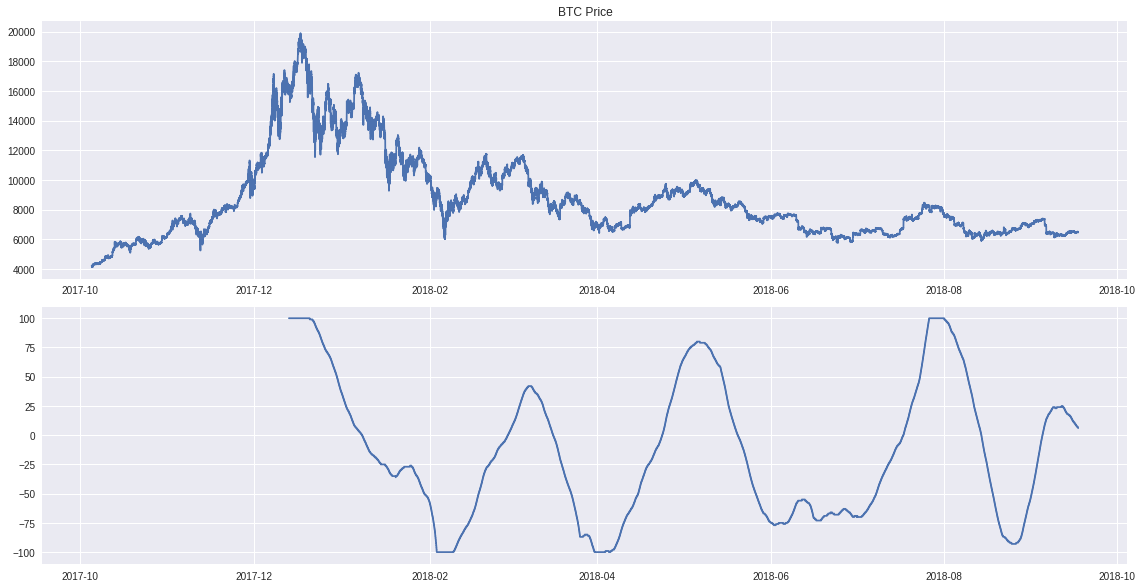
This is just a quick chart of one of the oscillators I have been working on. The line on the top is the Bitcoin price, and the one on the bottom is the corresponding indicator value for the given data point. Look how closely the lows and highs match the relative dips and peaks of the price line. I think, I might be onto something interesting here.
NOTE: This is no trading advice of any sort, but just some observations resulting from my studies. Always do your own research!